Work
About
Connect

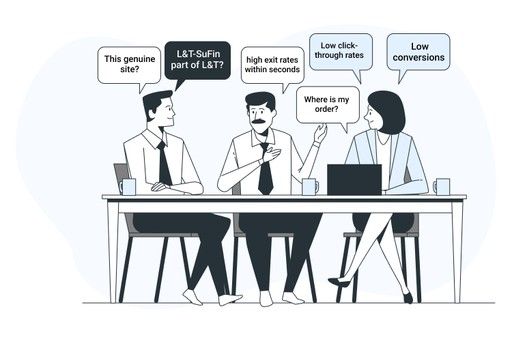

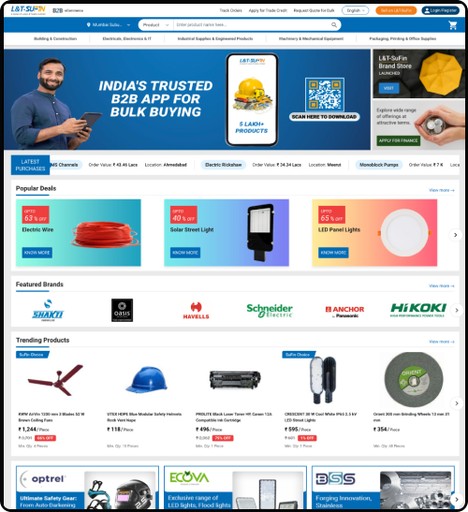
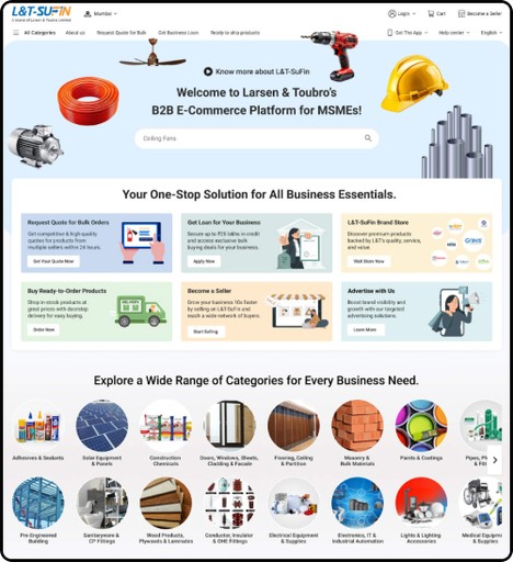
Pains
High Bounce Rate:
Users quickly leave the homepage due to unclear messaging and poor navigation.
Low Engagement:
Those who stay often don't interact or explore further, resulting in low click-through rates.
Confusing Branding:
Users are unsure about the connection between L&T and L&T-SuFin, causing trust issues.
Poor Navigation:
The homepage lacks intuitive navigation, making it difficult for new users to find what they need.
Lack of Trust Signals:
Insufficient trust-building elements like certifications and testimonials undermine platform credibility.
Low Conversions:
The homepage fails to guide users towards desired actions, such as signing up or making purchases.
No Clear Value Proposition:
The platform's offerings and benefits are not communicated clearly, leaving users uncertain about its value.

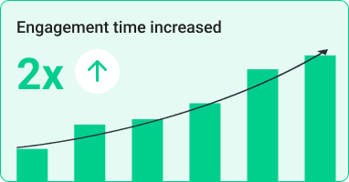
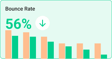
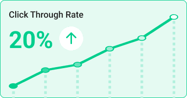
Gains
Wide Reach:
The homepage attracted a significant number of new visitors, with 80% plus being first-time users, showcasing strong traffic potential.
Established Brand:
Being part of L&T, the homepage benefitted from the overall brand recognition, which could be leveraged for building trust.
Existing User Base:
Despite the high bounce rate, some users did stay on the site, showing potential for better engagement with improvements.
Product Offering Clarity:
The platform did showcase various product categories, but it lacked clear communication and emphasis.
Traffic Potential:
The homepage had a steady influx of visitors, which offered opportunities for improvement in retention and conversions.
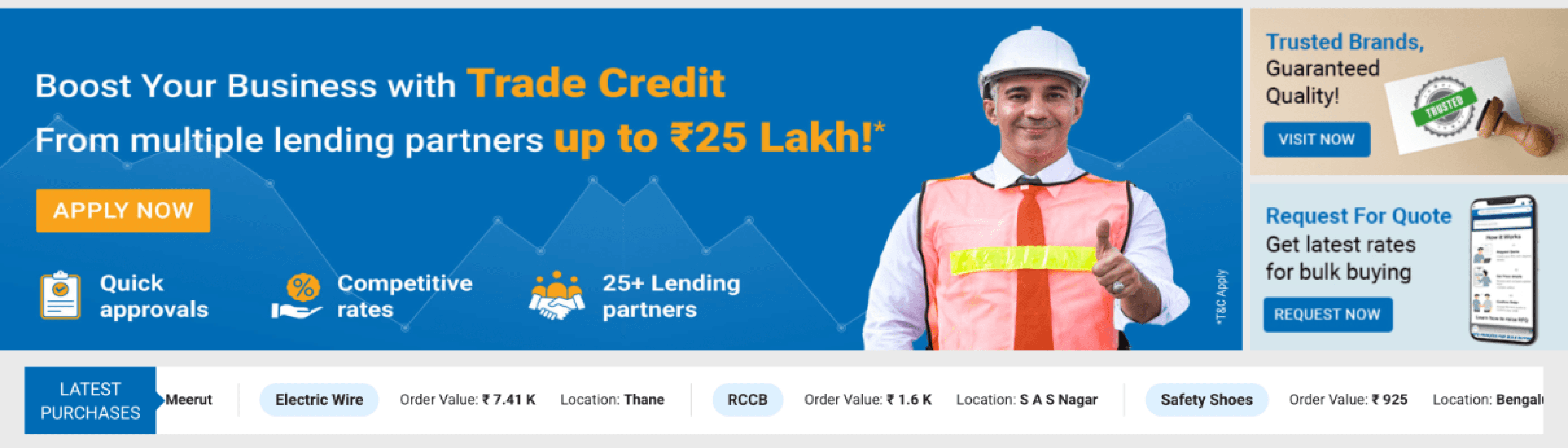
Mobile App Promotion:
The homepage provided an opportunity to promote the L&T-SuFin mobile app, encouraging users to download and access the platform on the go, enhancing accessibility and engagement.
Easy Access:
Users had quick access to core offerings and features, although the experience could be streamlined for better navigation and overall usability.


Solution
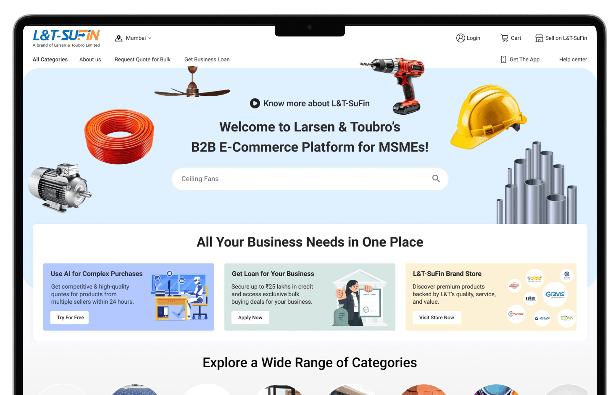
Category: To improve category exploration and help users find products faster, a single entry point should be designed to centralize all categories.
Search Bar: To make the search bar more engaging and user-friendly, integrating animated placeholder text with top-selling product names can guide users effectively.
Business segment: Give more prominence to the value propositions, enhance understanding of our business, and drive users to the conversion funnels
App Downloads: To increase app downloads, a dedicated "Download the App" link should be prominently placed across the website.
Delivery Location: More prominent to Select location
Help: To enhance user experience and reduce support queries, introducing a Help Center (FAQ) link is a great idea.
New Design
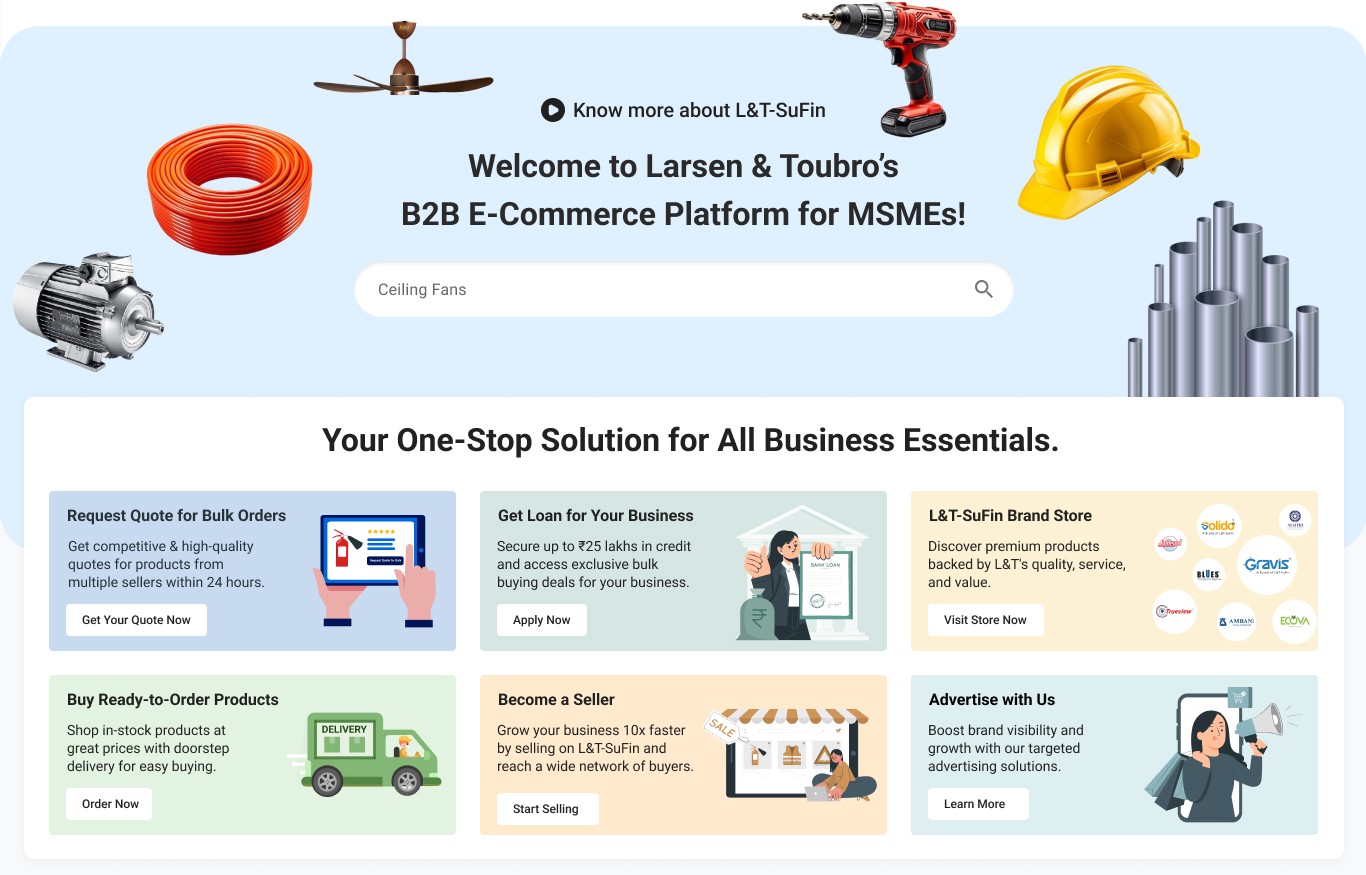
Solution
66% user start buying journey from search. To make the search bar more engaging and user-friendly, integrating animated placeholder text with top-selling product names can guide users effectively.
To effectively showcase how L&T-SuFin works, the brand video should be strategically placed and optimized for maximum visibility and engagement.
To reinforce brand trust and leverage L&T's strong reputation, it's essential to clearly highlight that L&T-SuFin is a part of Larsen & Toubro across the platform.
To ensure users quickly understand L&T-SuFin's value proposition, a dedicated section highlight core offerings and key services in a clear, visually engaging way.
L&T-SuFin is exclusively for industrial products, the static banner should prominently display relevant products and messaging.

Problem
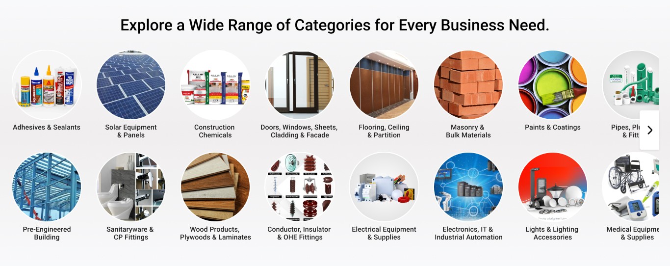
Navigation structure is making it difficult for users to find specific categories within the 5 super categories, especially when you have 48 subcategories (e.g., Solar Equipment & Panels, Medical Equipment & Supplies).
Solution
Enhance category discoverability by introducing a dynamic category exploration section on the home page. The category placement will be dynamic, based on:
Best-Selling Categories, Trending Categories, Promotional Categories. Use product images to make navigation intuitive. Add a horizontal scroll to make it easy to browse multiple categories.
Problem
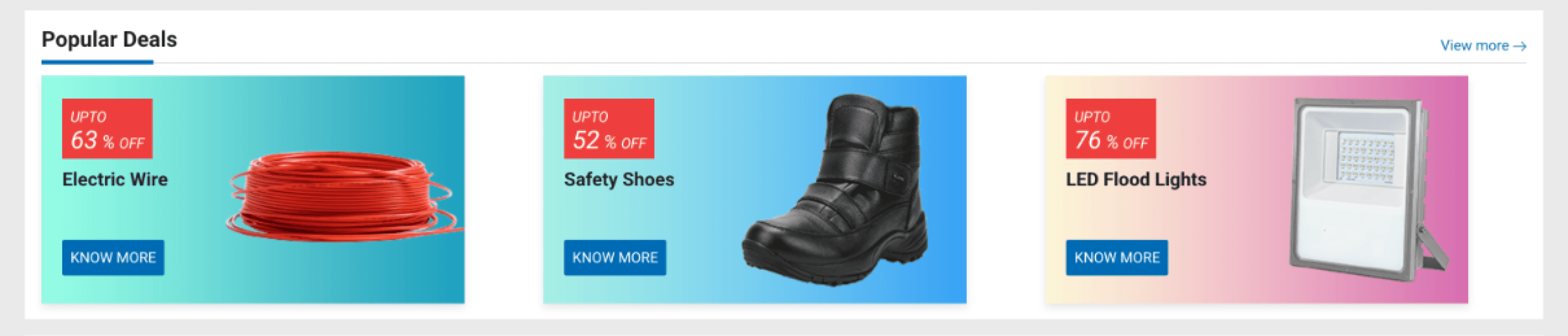
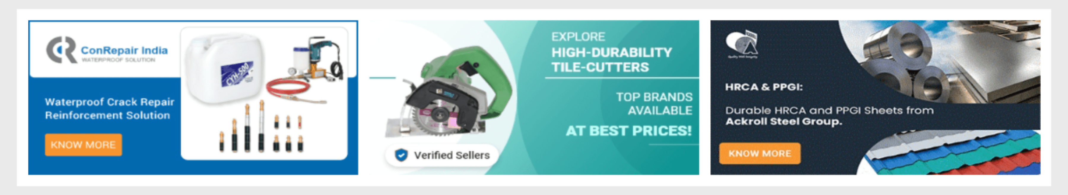
Popular Deals: Discount Labels Need More Emphasis - The "UPTO X% OFF" labels are effective, but the font size of "X% OFF" is small and less prominent than "UPTO". This reduces the impact of the discount message.
CTA Buttons Lack Visual Hierarchy - The "Know More" buttons are well-placed but do not stand out enough from the background. The blue buttons blend slightly with the blue gradient of "Solar Street Light". & Use Stronger CTAs like “Buy Now” or “Get Bulk Discount” instead of “Know More.”
Need more emphasis on the product images, not the background gradient
Problem
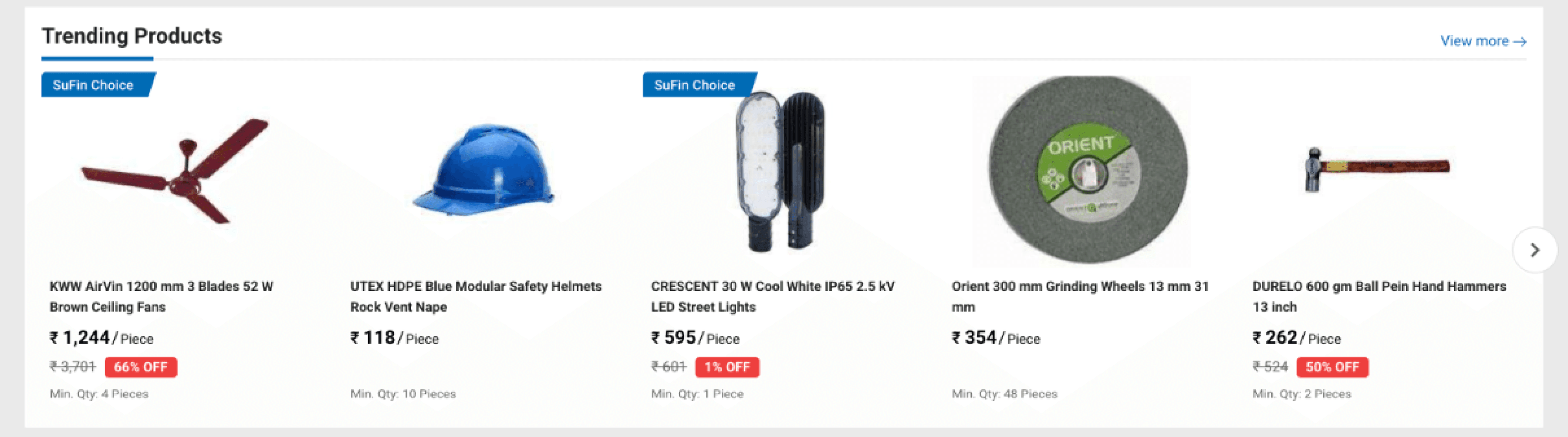
Product Suggestions Section - Lack of Visual Hierarchy (Price & Discounts) - The discount percentages (e.g., 66% OFF) and pricing details are small, making it harder to scan quickly. The red discount labels help, but are not prominent enough.
Minimum Order Quantity (Min. Qty) is Not Emphasised - Many products have a minimum order quantity (Min. Qty), but it is displayed in small text and could be easily overlooked. Users may add a product to their cart only to later realise they must buy in bulk.
Product Names are Long & Hard to scan. Product names (e.g., "CRESCENT 30 W Cool White IP65 2.5 kV LED Street Lights") are too long, making them difficult to read quickly.
Solution
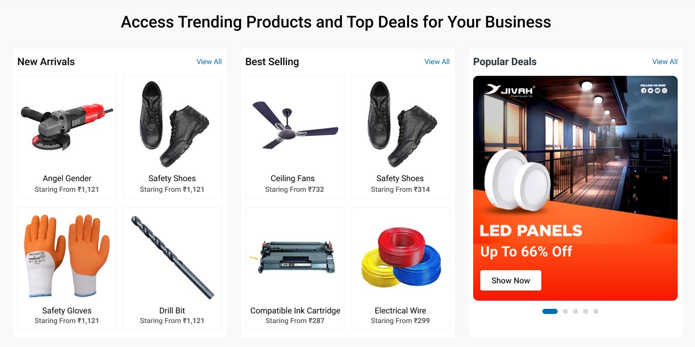
This season of the website to navigate user that L&T-SuFin also selling Buy- Now products (finished goods, ready to ship)
Deals: Visually appealing with a premium ad-like design. Carousel format allows multiple deals without taking up too much space. Strong CTA with "Show Now" button.
Product widget: Segmented Product Categories: Separates "New Arrivals" and "Best Selling" to help users navigate. Minimalist & Clean UI: More whitespace improves readability and aesthetics. Better Text Readability: The product names and pricing are clearer.
Problem
No title for this section. CTA is not available in all banners. Less emphasis on individual sellers. Text and images may feel cramped. Not as visually engaging.
Solution
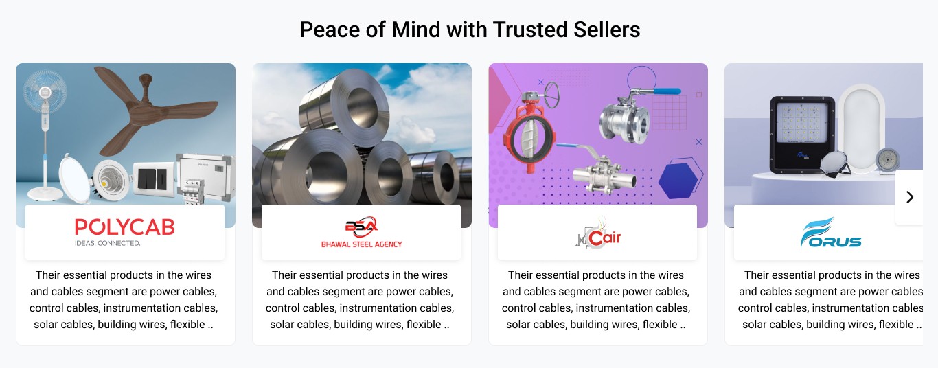
Provide a title for this section & make this section dynamic
The goal is to build trust and credibility. Rather than banner style, we introduce a grid style layout design is better because it gives detailed visibility to trusted sellers and their products.
Grid Style: Visually appealing and well-structured. Highlights trusted sellers with product images and brand logos. Provides a brief description of the seller and their offerings. Clean and professional look with uniform card-style design.
New Design
Solution
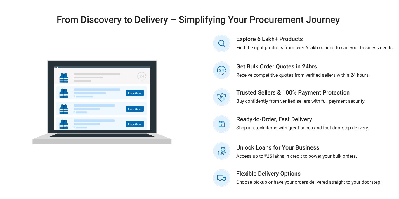
In B2B eCommerce, the purchasing journey is often more complex than in B2C due to factors like bulk orders, payment terms, delivery logistics, and approvals. The "How It Works" section plays a vital role in simplifying this process and driving conversions.
Reduces Customer Support Queries: B2B buyers often have questions about order processing, delivery timelines, or payment security.
A clear, visual explanation reduces the need for support by proactively addressing common concerns.
Value: Saves time and reduces the burden on customer support teams.
Simplifies a Complex Buying Process: B2B purchasing often involves multiple steps: Product discovery, Quote requests, Price negotiations, Payment terms, Shipping and delivery A structured "How It Works" section simplifies this by breaking it down into digestible steps, making the process feel easy and approachable.
Value: Reduces confusion and makes the website more user-friendly, especially for new visitors.
Builds Trust and Credibility: B2B buyers often deal with large order volumes and significant financial transactions.
A clear step-by-step guide reassures them of the platform's reliability, showcasing payment protection, verified sellers, and delivery guarantees.
It reduces friction by addressing common concerns upfront (e.g., payment security, delivery speed).
Value: Increases trust, making buyers feel more confident in placing large-volume or high-value orders.
Problem
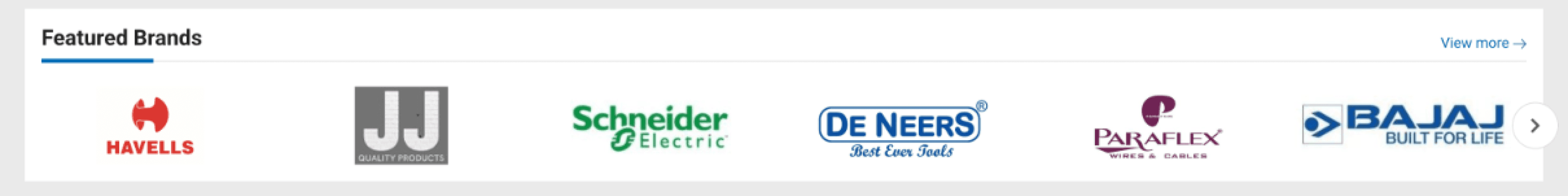
All logos do not appear at the same size with equal importance. Limited brand visibility, only a handful of logos shown. Less visually engaging design. May not highlight the full range of brand partnerships effectively.
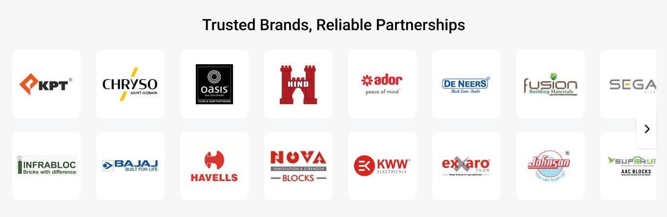
Solution
The headline is prominent, reinforcing trust and reliability. More extensive brand showcase (more logos displayed at once). Organised in a grid format, making it visually appealing and easy to scan. Brand logos are evenly spaced and aligned, creating a clean and professional look. Supports brand credibility by displaying a large number of partners.
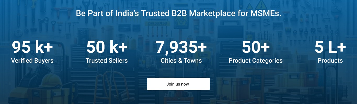
Solution
In B2B eCommerce, where buyers and sellers make rational, research-driven decisions, a sign-up section with key marketplace statistics plays a crucial role in driving conversions.
Builds Instant Credibility & Trust: Displaying statistics like a number of verified buyers, trusted sellers, product categories, and locations served reassures users that they are joining a well-established platform. Large numbers create a sense of scale and reliability, making users more confident about engaging with the marketplace.
More sign-ups lead to more buyers and sellers, enhancing the marketplace’s value. As the user base grows, so does product variety, competitive pricing, and transaction volume, making the platform more attractive over time.
Solution
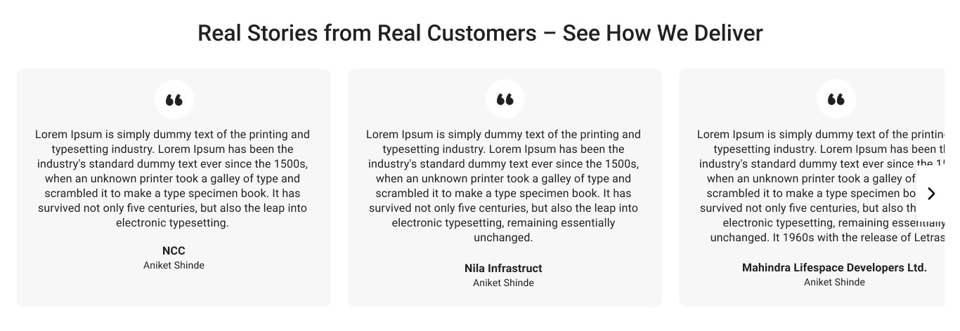
In B2B eCommerce, trust and credibility play a critical role in influencing purchasing decisions. Unlike B2C, where emotional and impulse buying can occur, B2B buyers make rational and research-based decisions. The Testimonials Section is a powerful tool to build credibility and influence potential buyers. A well-structured testimonials section is not just about showing reviews—it’s about strategically placing real customer success stories to remove doubts, influence decisions, and build long-term trust.
Solution
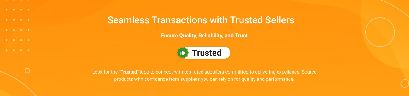
In B2B eCommerce, where large transactions and bulk orders are common, trust is crucial. The Trusted Seal section reassures buyers by confirming supplier credibility, product quality, and transaction security through verified seller badges and payment protection. This reduces hesitation, builds confidence, and ultimately improves conversion rates.
Solution
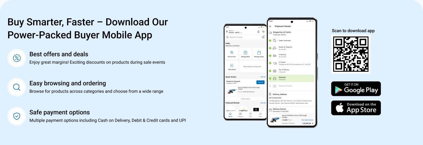
The App Promotion Section isn’t just about marketing—it’s about driving mobile-first adoption, boosting user engagement, and enhancing the B2B procurement experience.
User Benefits are Well-Presented: Three key benefits (Best Offers, Easy Browsing, Safe Payments) are displayed with icons, making them easy to scan.
Clear Headline & Value Proposition: "Buy Smarter, Faster" immediately conveys efficiency, which is crucial for B2B buyers. "Power-Packed Buyer Mobile App" hints at comprehensive features.
Strong Call-to-Action: The QR code allows instant scanning for quick access. Google Play and App Store badges reinforce availability.
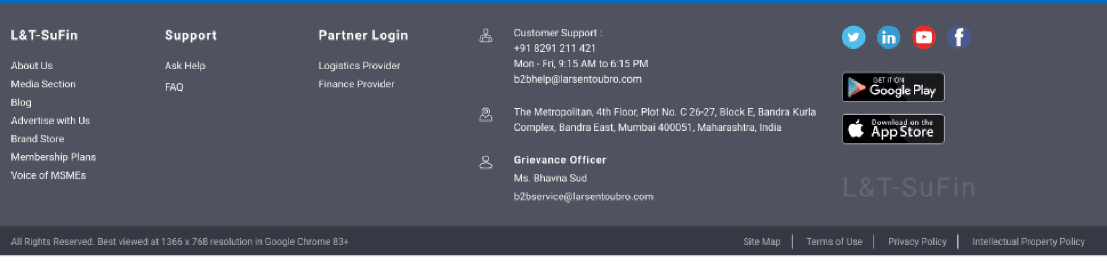
Problem
The support section is not as prominent. Seller section links are missing. It lacks a "Need Assistance?" section, which could help users quickly access support.
The hierarchy of information is not well-optimised (some links seem less emphasised).
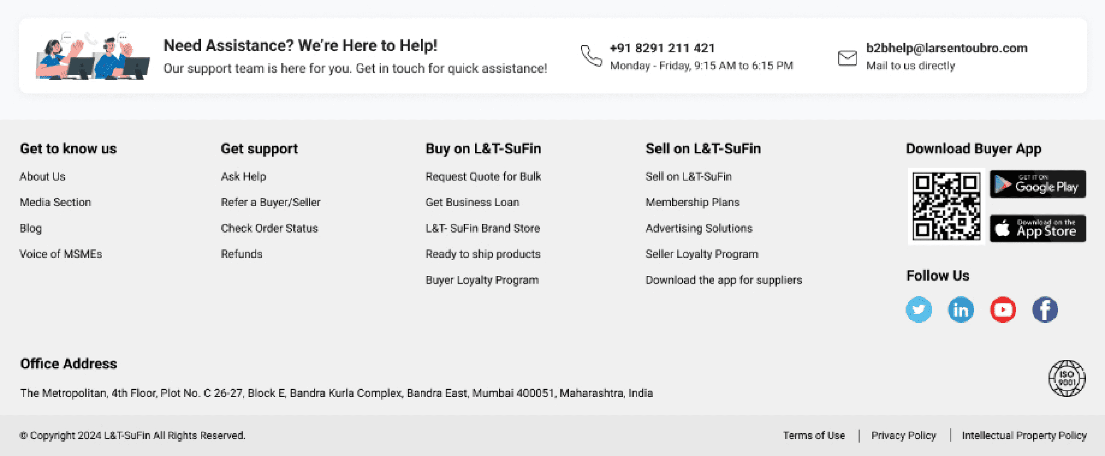
Solution
The "Need Assistance?" section at the top makes it easier for users to find customer support. Clear sections for "Get to know us," "Get support," "Buy on L&T-SuFin," and "Sell on L&T-SuFin." The QR codes for downloading the app provide a quick way for users to access mobile apps. ISO Certification Badge: Adds trust and credibility.
Implementation & SEO Considerations
Key Insights from V2 A/B Testing
Recent A/B testing for Version 2 has revealed valuable insights and could see major improvements. We're continuously improving the site to enhance user experience and performance.
Work
About
Connect